Pareto Chart

Hi, there this is Mike.

I want to thank everybody who wrote in earlier this week and answered my three questions. The more I know about what you are looking for, the easier it is for me to develop the content you like and can use.

We plan to double down on the things you like while improving some of the ways we deliver the content. Just because I’m not asking every day what you like or don’t like and what you can use or cannot use, does not mean that we’re not interested. As you find entries that are useful, please let us know. If you find things you can do without, that’s even more important for us to know.

I know some people are concerned because they’re afraid if they make a comment, they will end up on my mailing list somewhere.  I’d make everybody this promise, “I will never put anyone on a mailing just because they commented on one of my blogs.”

If you would wish to be on my mailing list, please let me know. Otherwise, reading and commenting on the blog will not put you on a mailing list. This is a promise between friends, me and you.

As promised, today we are looking at a real Pareto chart.  I was going to use a computer build line to show it.  I thought it would be better if I used SAM and his scenario as the backdrop for this.  We all know about SAM’s work.

SAM has been keeping a tick sheet with the number of each type of problem he encountered.  This was before everything got fixed last week.  The tick sheet looked like This:


Problem Occurrences Tic marks
Car will not start 6 XXXXXX
Lost car keys 10 XXXXXXXXXX
Saw snakes 2 XX
Had to borrow money 1 X
House over 80° 1 X
Total 20


Once SAM collected these numbers, then he could make the Pareto chart. You often hear that the Pareto chart shows where 20% of your problems cause 80% of your work

Rear Real Pareto

The chart shows us what to tackle first to get rid of the biggest hitters. Very small numbers are showing minutia. Minutia is a word for all those little bitty annoyances, they don’t cause the big problems and fixing them won’t fix the big problems. That’s why we use the Pareto chart so we can identify and fix the largest problems first.

Once those problems are fixed, guess what, the smaller problems have moved up to be the largest of the problems. This is presuming another unknown large problem has not shown itself yet. And once the medium and smaller problems are now our top problems, we can turn attention to those and fix those also. We don’t leave problems unfixed, we just fix them in order.

I hope this helps.  Tomorrow I will have a new article, and next week I will start a story that is told in graphics and pictures.

Have a great day.

I Would Like to Ask You 3 Questions

Hi everyone,

Hope you are doing well.  I attended a couple of classes last week and did a lot of research and learned a lot.  To make sure I am delivering the type of blogs you would like, I would like to ask you to answer 3 questions.

You can answer them in the comments, and it is a very short set of questions.

  1. Does what I write interest you?
  2. Do you prefer lessons, papers or articles?
  3. What is your favorite topic(s)?

Please use the comments section send your answers.  In the meantime, I will keep sending a mixture of old delivery systems with some new ideas and twists.

Thanks,

Mike

This is why

Thank you for joining us again. We are glad to have you here with us today.

This week we have been working on how to wrangle an overwhelming set of larger-than-life problems into a set of easily workable solutions.

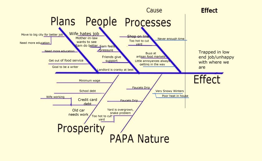
As you seen over the last few weeks, this is absolutely possible. It starts when you admit there are problems, you do an affinity diagram to get an idea of the total landscape concerning the processes. Create a cause-and-effect chart so that you can see the causes that are happening right now and you see the effect you’re having right now. Knowing now the effect that you have and the effect that you want to have, which are probably two different things, you can now look at what causes you might be able to change to make the effect better.

Next thing you want is real data. If you remember, earlier we were working on the home front and as such using some anecdotal information. In business and home efforts, the more data you can gather, the better your efforts are going to be to correct and improve concerns.

In business, we find ways to place measurements on those things we are concerned about. It can be as simple as somebody doing a process and keeping a tic sheet of problems. The measurement could be as elaborate as automated or semi-automated shop floor data collection systems that gather information every time a unit is moved from one location to another, or as critical parts are added. Shop floor data collection system (SFDC) works great for business.

An example of how the SFDC system helped me to find and correct a problem on the assembly line when people from the line started coming to me one day and telling me that there were big problems. They said everything was the moving slow and there were many units that had to be reworked due to poor workmanship and scratched parts.

The first thing I did was pull up the data on the computer. The data showed me that there had only been two items that had to be reworked. One was a screw that was not properly seated, and the other was a cable that was not properly plugged-in. There was no mention of scratches.What worried me though was a line that was supposed to put out 50+ units in an hour, only about 17 units per hour were being completed and packed.

I had been on the line at shift change that morning, and everything looked fine then. That was just three hours ago. I went back out to the production line, and yes it was backed up. I started going station to station to and asking people how things were. In short time, I found out that the quality technician at the end of the assembly line was finding many build problems. The quality technician was trying to make the line look better, so rather than reporting the problems in the SFDC system, was repairing all the problems rather than sending them to rework.

I got with a line supervisor and had the line stop for a quick meeting. I explained everybody why it is important to everyone involved that we use the system correctly and that we actually record all problems and record all repairs. I also explained that the reason for the use of that system was so that I could actually see the problems that were happening on the line. I could quantify them, and then I could change the processes to eliminate the causes of those problems. I also had to explain everybody that when they log such problems they were not getting themselves or anyone else in trouble. They were actually doing what was required and what the engineering department needed to make the processes better and easier for them to use and make everyone’s job easier.

After that, I got better data and was able to design much better processes which allowed for higher quality and easier assembly.

I have also had times where people came in and complained that every other screw was not inserted properly. Going out and doing spot checks on the line, I found out that the shop floor data collection system was correct. Only two screws had been not fully seated, and everything else was fine. A couple people on the line were just having a bad day. I talked with them and was able to let them vent their frustration (which were personal, and not about the build), and then they were able to complete their shift without having the concerns, which really weren’t there to start with. In both cases, without eyes on the line and the shop floor data to show what was real and what was not, as the engineer I would not have been able to make the right calls and build the right processes.

In the first scenario that we looked at wrong data would have led to a poor status quo because the processes would not have changed. In the second scenario, having the correct information allowed us to keep processes that were working, and identify and fix the true concerns.

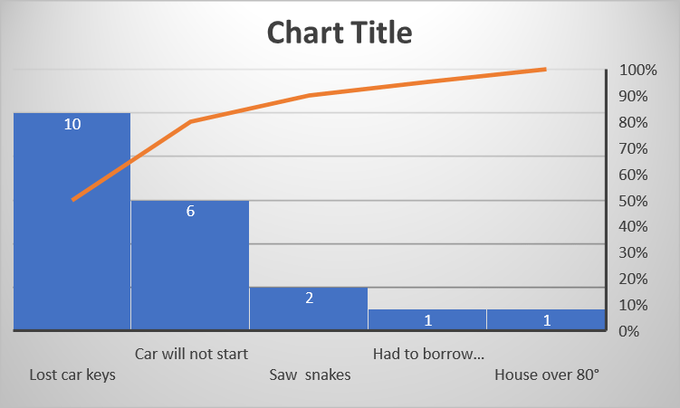
This is why we will also go back and look at the Pareto chart in other uses. I will give you ideas for how it can work at work and how it can work at home.

Before I leave you today, I need to ask a favor. This favor is to help me to better help you. The question is, are these posts on quality and process improvement something you want to learn? Or do you want to learn something else?

I ask you this because I’m taking two courses this week (yes, teachers take a lot of courses.) We are at the part of the course where we are ensuring that the classes we write are classes wanted by the folks who read us. If there’s something else, you would rather learn, please let me know. I would be more than glad to write on those topics also. If you have any thoughts or ideas, please let us know in the comments section on the blog. I will contact you and try to make other subjects happen.

Thank you for reading this today and thank you in advance for your thoughts, ideas, and comments.


The Problem Ranking and Planned Fix Chart

Welcome back we’re glad to have you with us again. If you’re new, we are glad to have you too.

We are looking at various ways we can use process improvement tools in our daily life. If this is your first time joining us, or you joined recently, you may wish to look back at the blogs from June 5 and coming forward. It will give you a better idea of what we are doing.

Yesterday I talked with SAM, and he added to his list. It is below in the form of a chart, and we will get to it in a few minutes. First, though, I need to tell you that what we are going to do today is a highly modified Pareto chart. Pareto charts are usually built on data rather than just anecdotal information.  After we do this for the home, I will also (next week) make a Pareto chart for a work situation so you can see the difference.

For now, how can we take the every day and add quantifying data? It’s not as difficult as it seems. Let’s look at the problems, and next to them (in the chart below) we will add some data I was able to glean for some of them. Remember antidotal problems are still problems. Fixing problems is just easier when you can measure them.

Here are the concerns and what SAM has told me:

  • SAM said that there were snakes in the yard and it was too hot to cut. When I talked to him, he said they had seen eight snakes in the last month. We have data we can use.
  • In winter, there is little heat in the house. We moved that statement to down the list. SAM said it barely gets over 60° in the house during some storms. Now we have data and identification of a health risk due to possible hypothermia. Yet right now it is summer.

I think you get the idea on finding some data for measurements.  There were talks and discussions. The same friends who helped with the affinity chart came over and helped them to think of ideas on how to rank the problems and cure them. For where they were, and what was going on, everyone it is agreed it would be okay to ask for little support.

Talking to others is great. A few neighbors, worried about the lot volunteered to help the next Saturday. Another neighbor had a good mechanic who needed some copywriting done for ads he wanted to run. SAM is working to be a writer. A trade of services could greatly reduce the costs of getting the car fixed. The mechanic got ads, and SAM got to work on a project with his writing skills.

The landlord was invited over for fried chicken dinner that was supplied by SAM, his wife, and his mother-in-law. The landlord appreciated the good-looking lot. All the noise created by everyone working (and being very careful) and making a lot of noise scared away the snakes.

Talking to the landlord, the idea of saving money on the water bill was viewed as a great idea, and he personally came over the next week and replaced all the washers in all the faucets.

Below is the chart that shows the ranked problem areas, the measurement, and the fixes.  As I said this is not the normal use of a Pareto, and I will show you a regular Pareto chart in action, next week.  For now, we will call this chart ‘The Problem Ranking and Planned Fix Chart’

Problem Ranking Problem Data Fix
1 SAM said that there were snakes in the yard and it was too

hot to cut.

Saw eight snakes in the last month. In the early morning next Saturday, the group of neighbors who found out about this problem while talking to SAM will come over and have a house party to help them cut the yard and fix the place up. We thank SAM’s mother-in-law for talking to friends and helping to get this started.
2 Car needs to be fixed Car failed 3 times in one month The car failed to start three times in the last month. That is the problem and the data. This moves to number two on the list. It is now July, and the house heater has until November when it will be truly needed. Lack of transportation isolates people.
3 Money in is less than money out. Income per month is $1500, and pay out to bills is $1750 School debt, minimum-wage, and credit card debt can be put into one item. Money needs are not supported by the wages earned. Add up to everything that must be paid in the month and all the monies that are brought in in a month. If the income is less than the payments required, there is the data.
4 SAM and his wife needing jobs better jobs Quality of life and ability to meet each person’s potential We combined both into one item. This is not a matter of “Gee, I don’t want to work,” it is a matter of them fulfilling their potential. They cannot quit and hold. However, they can seek and find.  With the car fixed, they found good jobs in a medium sized city, just a 15 mile drive each way.
5 House too hot in summer Uncomfortable Their next-door neighbor had 2 fans in the attic doing nothing.  These were loaned to SAM and his wife
6 Too cold in the winter Health Hazard The landlord had the heater inspected, and all the vents cleaned.
7 Poor shopping choices considering the income Too Costly An agreement to stay within a set meal budget was agreed to, and a garden was planted in the now snake free yard.
8 Being overwhelmed Too many problems with not enough ideas SAM and his wife learned many good skills from their friends studying process improvement.  Those skills now serve them at home and at work.
9 Cranky Landlord Scary Everyone responds well to positive communication, collaboration, and a great fried chicken meal.

We will continue tomorrow with how data can help show a hidden factory.

Have a great Day.


SAM’s List

Thank you for allowing me to be back with you again.

I hope you had a chance to read yesterday’s blog and make a list of those concerns and problems which are trying to overwhelm you. One thing to remember is that you were rarely alone.

Because I do not know the specifics of everyone’s problems or what their list may hold, it would be wrong for me to suggest somebody perform a set of action items based on that list. Yesterday we talked about making a list, and the lesson plan called for you to make a list. This list will be for your use after we’ve gone through this week’s lesson.  By the end of the week, you should have a good idea of how it works.  If you want to ask questions at that point, please write or call me, and we can talk about them,  The list is a starting point so you can try what SAM is working on right now.

Remember SAM? We looked in on SAM last week. He was having problems, and we watched as he made an affinity diagram, and a cause-and-effect chart (Fish-bone diagram.) Cause-and-effect charts and affinity diagrams are great for pointing out concerns and problems. By changing the causes, you are able to change the effects.

SAM made a list last night.  SAM is a pretty smart avatar. And we are going to look at his list  and help to get things sorted out.

Sam’s list looks like this:

SM'S PRO

+= a safety concern     * = a Health Concern

The big thing to remember when you start looking at problems is that you are not alone.  You may have friends, family, significant others, social clubs, religious organizations, or neighbors. You also have this blog. Please remember that nothing is so horrible it can’t be worked out and good remedies taken. And also, please remember the rules of numbers. One person can be fooled, overtaken, or defeated however some people working as one can easily win the day.

SAM did a pretty neat job on his list. I did notice he left out some of the concerns he had listed earlier.  Although everything gets tackled in an order according to how it affects the overall flow of the home and work, if an item is not on the list, it misses getting considered.  The list will be in great turmoil if it is unnecessarily interrupted.

Please notice that SAM noted safety and/or health concerns.  Putting these issues towards at the top of things to fix helps to save money and heartache in the long run.

Did you leave anything off your list?  It is better to acknowledge a concern than to ignore it.  Ignored items have a tendency to come back and get us.

Consider this and tomorrow we will help SAM (who will have a complete list ready) to plan his order of attack on the problems and have some solutions ready to go.

I think you are really going to like the actions and ideas SAM and his friends have in store for tomorrow.

Thanks for being with us today.

We Need a Win-Win Situation

I hope all is going well for you.

Hope you haven’t had some days like I’ve had lately were problems just seemed to ooze out of the woodwork. Not bad problems, just annoyances the little things that can get under your skin and just build up. Sometimes I find myself trying to fight everything at once, and just being overwhelmed. Do you ever have times like that?

Do you ever have times where the car acted up? The wind blows the wind turbine off the house, and there’s a hole in the ceiling? Money gets tight, as the cost of food goes up? The toilet won’t stop running, and the place feels too hot and too cold both in the same day? Cleaning up the messiest room could be easy, yet first, we would have to get the rooms to stop vying for the ‘Messiest Room in the House’ award. Ever get despondent and throw your hands up in the air just not knowing what to do?

I have done this before, and probably most the people reading this have been there. The way I see it, there a few things we can do. We can stay in bed pull the covers up over our head and ignore everything. That means the problems win. We could ignore everything and just walk away. Unfortunately, the problems win again. We could try to tackle all the problems at once, yet, I’m pretty sure they would overwhelm us. I don’t mind somebody else winning I just hate to lose. We need a win-win situation.


Time to press for the start of the win.


If you have a system working for you, such as Covey’s four square using urgent, important, not urgent, and not important or, another system, stick with it and please share with all of us in the comments so more people can learn and/or be helped.

If no system is working well, please make a list of your problems and annoyances, and how often they happen. Tomorrow, we will show how to take the list of problems and cut it down to size.

Please remember that dealing with problems is the same as eating an elephant. You do know how to eat an elephant, don’t you? One bite at a time.

I’m looking forward to next time, I hope you are too.

Root Causes and Why

Hope you are having a good week.

Looking back over the week, we’ve talked about affinity charts and cause-and-effect diagrams which are also known as Fish-bone diagrams. And then we met SAM, and we saw both tools in action. SAM is worried about things, and now he knows, at least he’s doing something about it.

Whenever you are having a problem, and you are either not sure where to go, or you are not sure what the solution might be, the affinity diagram and the cause-and-effect chart are great places to start. Remember, if you do it by yourself, you only have one point of view. If you have a team or others to work the charts with you, such as the mentors and supporters we talked about back in June, you get a better view of what is happening. The better the views, the better the outcome.

When you have a problem or concern, you can put a Band-Aid on it, and it is okay for the moment. The problem with Band-Aids is that they fall off and you’re forced to deal with the problem again. The affinity chart and the Fish-bone diagram allow you to look deeper into the problem. What you’re looking for is the root cause.

Consider the root cause something akin to the small pebble in your shoe. By itself, it’s just a pebble. However, when it gets in a strategic place, it starts to be a pain. It hampers forward motion and elicits aggravation and soreness throughout the entire body.

When trying to remove the problem, you need to know you have found the root cause. You need to follow the actions of a three-year-old. My three-year-old was always asking me why. And as you work on these charts a technique to help is to continually ask why. Ask why very time you find an answer until you cannot find an answer to your next why.

When you get to the point where you and ask a why and cannot find an answer, you are probably at the root cause. Unfortunately, that is not guaranteed. You will have to run an experiment or maybe even 2 to ensure you have the right culprit.

Coming up in our next group of blogs, we will look at SAM some more, and help him to figure out which problems need to be tackled first. We will also run an experiment or two to ensure we are on the right path and looking at the right solutions to the problems.

If you would ever  like to ask me a question, you can type it in the comments section. I usually receive those and try to answer them as soon as possible. Usually within 48 hours.

If you need to talk with me, please go to www.readingsticks.space and within that website, I have a scheduling system for phone calls. If you sign up on the schedule, I can give you a free one-half hour phone call, where we can answer questions, go in more detail, and/or assist in items you are working on.

This is a fun week, thank you for being with us.


SAM

Today, I am giving you the case study of SAM. SAM is in all caps to distinguish him as an avatar. SAM is an avatar I use to demonstrate how tools work.  I like to use avatars because no one wants me to put their real information out to the public

I am often asked, who do I write for and who do I design my courses for. The people who ask these questions often want to know the age, gender, what the people had for dinner last Tuesday night, and specific problems of my students. I am not sure that that truly captures the people I work for and with.

I am writing for people who find themselves wishing or needing a transition from one stage to another in life. For the majority of people, you might say, someone over 55 is looking to transition from full-time work to retirement and possibly part-time work or a business of their own. For those between 38 and 43, the desire is often a new profession. For those between 26 and 32, there is a desire to ensure they are on the right path to their goals in life. And, those just exiting formal training for the first time, whether high school or college, want to ensure they emerge successfully into the job market.  I promise to share case studies for each of these as time goes on. I just want to remind you that we are people and not statistics.  Some people do different things at different times.  That is all right.  It is known as being human.

For now, we are going to start with Sam who graduated college at age 24, is about to turn 26 and finds himself unhappy, frustrated, and unable to find a path to where he wants to go in life. Finances, location, lack of local employment, and other factors all play into this. Yet SAM is lucky because SAM has friends, and friends know how to find the paths.

SAM

Sam’s Background

Sam is a regular guy from Any-town, USA.  He just graduated college about a year and a half ago. He married his high school love and got one of the few jobs the town had to offer, a food service worker, at the Dairy Duke.

Sam wants to be a writer. He wants the American dream. Unfortunately, a new family in a small town just starting out life finds there are many hurdles to overcome before dreams start to come true.

Sam’s not happy because he can see that he and his wife are not going anywhere and seems not to be able to find a better path. Sam’s wife isn’t happy, she thought marriage was going to be bliss. Sam’s mother-in-law likes Sam, yet she wants to see him reach out and do something for himself and her daughter.

A couple of friends who were studying process improvement offered a game or two which might help Sam out and help him and his wife to find their path. Sam was not sure at first; however, when his car refused to start for the third time in a month, he figured, “what do I have to lose.”

The team came over to his house and talk to the assembled folks. Sam had invited his mother-in-law, and his sister-in-law tagged along to see what was happening. The team explained about what they were learning in school and offered their services for free to help Sam and his wife find their way.

After talking for a little a while, the team played the affinity game with them to see how everybody felt and what problems there might be. And yes, there were some problems.

Sam's Affinity chart


Everybody had fun with the affinity game, and new ideas started to spring up. The infinity game (chart above) led to a Fish-bone diagram (below) which led to many other interests. I would tell you more now, except that may spoil some of the things to come. Therefore, we will start by taking a look at the affinity chart, and the Fish-bone diagram and that will start us on the way to helping to solve Sam’s problems.

Sams Fishbone

Tomorrow we will press on and see where this leads.


Enjoying Fish Bones

Have you played the affinity game?

Now is the time to do something with the data that you got from that game. Remember the five areas for the headers of all the Post-it notes that everyone placed on the board? Those headers were Plans, People, Processes, Prosperity, and Papa Nature. Well now, we can use the information you gathered to fill out a cause-and-effect chart.

The cause-and-effect chart is often known as a Fish-bone diagram. That is because it often looks like the skeleton of a fish. The one I have above probably bends that rule a little bit. The area where we have the effect is what you can think of as the head of the fish. And all the bones of the fish are all the things that we are filling in. This area is known as the causes. Thus, the cause-and-effect chart.

I should take time right now, to let you know you don’t have to be a master draftsman or artist to do this, or any of the charts and diagrams that we are going to make along the way. Each person does their best at arts and crafts. There will always be someone better and always be someone worse along the way, yet that never matters. The whole idea is that you are doing what you can when you work on these goals and games.

Go ahead and draw the outline for your Fish-bone diagram (Cause-and-effect chart.) And place the labels on. If you notice I wrote the word Effect below the line so you can write in what the effect is above the line. Please remember everything to the left of the head(effect) are the causes. When drawing the chart out, you do not have to put in the small horizontal lines coming off the ribs until you need to do so. I placed them in mine so you can have an idea of where they will go when you need them.

The effect could be, “We need to save more money.”, “We need to save more time.”, “I need to make better grades in school.”, Or anything else that you’re looking to improve. What this chart will show, as you fill it out is that all the causes equal the effect.

At this point take your post it’s, and start to fill in the five ribs on the cause side of the chart. At this point, the better the data that you put into the chart, the better the outcome. The whole idea of the chart is to see what’s happening now, and what effect that has. If you start doctoring the causes, or not putting some important data in, the chart will not be as effective.

The best thing about The cause and effect chart is that it is a very easy visual. You see what is happening, and what it causes. Too much late-night TV, not enough sleep, too many video games, not enough book time, it is easy to see what to change, to possibly raise your grades. Too many credit cards, not being paid regularly, a few emergencies, it’s easy to see what you can do to better manage her money. ‘My business is stagnating’ could equal, too many distractions, fewer classes, and more work, not enough interaction with the public, need to join some Facebook groups.

Everybody’s chart will be different, depending on the person, where they are, and where they want to go. There is no right and wrong in this. There is only where you are and where you want to go.

Tomorrow, I will introduce you to Sam. Sam’s been having a problem and wants to get back on track. We will use Sam as a case study. I will give you his affinity diagram, and his Fish-bone diagram. (Remember, the Fish-bone diagram and the cause-and-effect chart are the same things, and either name can be applied.) I am doing this because as we go on, it will be good to have some data to talk about.

I look forward to next time when we will go over Sam’s information and figure out the next step in helping him out.

Hope you have a wonderful day.

On this day, we celebrate the Declaration of Independence

Hi, because today is a holiday, I wanted to pass along this holiday note for the fourth.  We continue our normal blogs tomorrow.

Long distance relationships almost never last.  Mine did not last, although we are still good friends.  The relationship between England and the American Colonies did not last, although Britain and the United States are the best of friends now.

On this day, we celebrate the Declaration of Independence. Actually, it was signed on the second of July.  With no mass communications and no copiers in 1776, it took a couple of days to write copies and to get the word out.

It makes me wonder.  If long distance communication were available at that time, would it have made a difference?  Money is the root of many breakups. Could, however, the economic problems, between England and the Colonies be settled amicably before they grew so large that the two entities had no choice except the War of Independence and the legal separation, which was akin to a divorce of peoples?

This sounds like an academic quandary to be debated, and yet, we are on the cusp of the exact same problems in the very near future.  The people of Earth are planning to colonize the Moon and Mars.

The distance to the Moon and especially the distance to Mars will test the ability of communications. Not that communications are as slow as the 1700’s, there is a lag time that will start out as a nuisance.

Just as with England and the American Colonies. When the colonists of the Moon and Mars mine their ores, their focus will be on their work and not as much on the massive cost the Earth spent to get them to their colonies and provide for them as they began.  The Earth, like England, may be in a rush to reclaim the money spent to set up the colonists.

Special care needs to be planned for the missions to ensure a premium is placed on collaboration and communication.  These must be real communication and collaboration processes, not just buzz words.

Understanding what lead up to the Declaration of Independence 241 years ago is vital to future plans of colonization.  George Santayana reminded us why, when he said, “Those who cannot remember their past are condemned to repeat it.” (Wikipedia, last updated, 2/13/2006)

A special thank you to Paul Nielsen for his discussions and suggestions on this blog.  Thank you.